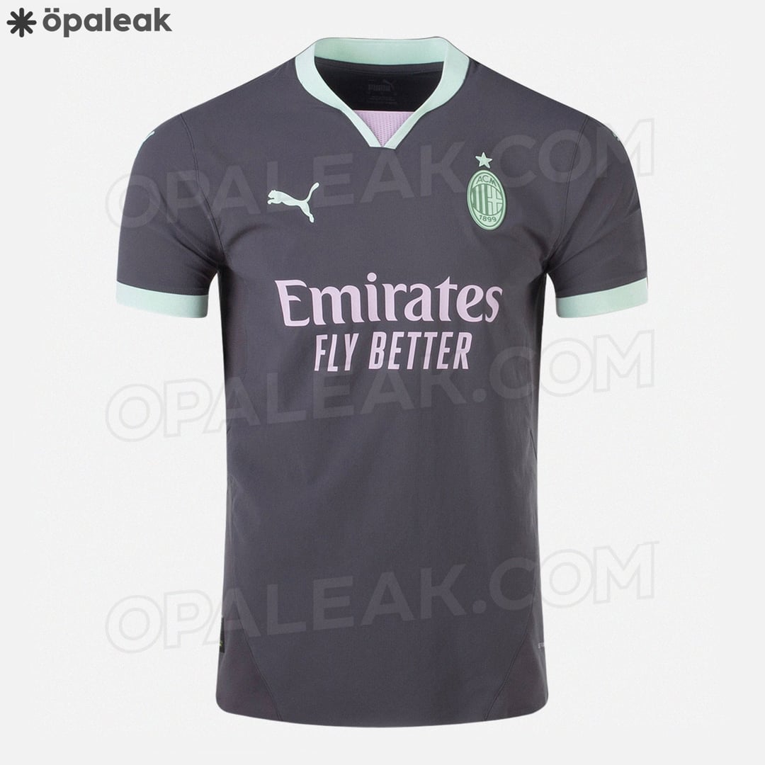
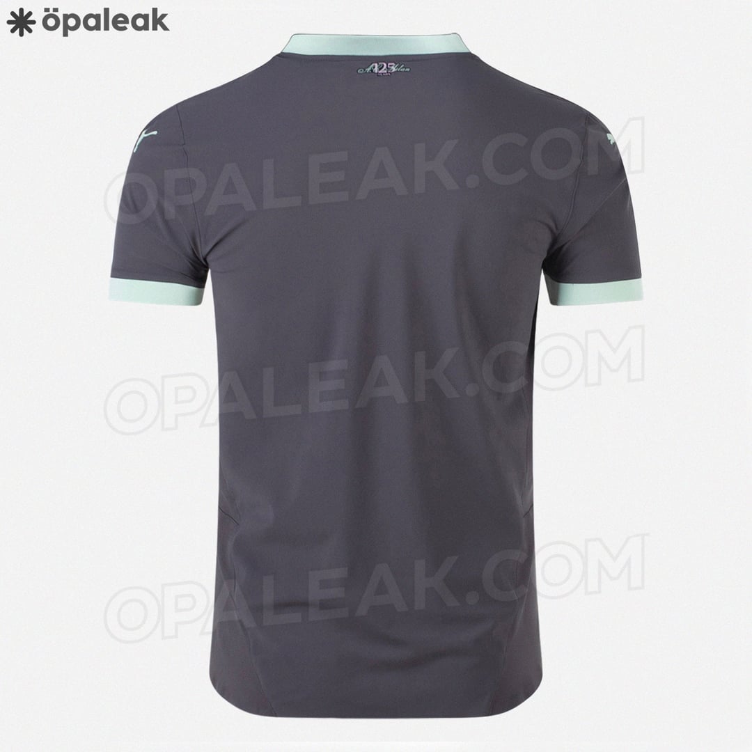
Hmm… Less spectacular than last season third kit but ok. It is clean and simple.
Avicennaete on
Wow it’s quite ugly ngl
-Z3TA- on
🤨
naterudeen805 on
Not great but better than this season
RdT97 on
Rare case where i like all our kits heading into the season.
Shinkopeshon on
This is one of the third kits of all time
Not mad though, considering I’m already planning on getting the home, anniversary and potentially the fourth kit next season lol
OneMaharajah on
Not bad, not good.
ParsedReddit on
So yesterday Away kit. Today is the Thirs kit so I can assume you will post tomorrow the Home kit?
lil5566 on
New Colgate sponsor incoming
VKingSlug on
Mint chocolate chip!
And_Yet_I_Live on
Looks ok
Emoz_ on
That mint is so ugly
lucs28 on
Wtf is that green?
flyaguilas on
So they’ll all be good, if unexciting. The away looks great, the others are fine.
milan_obsession on
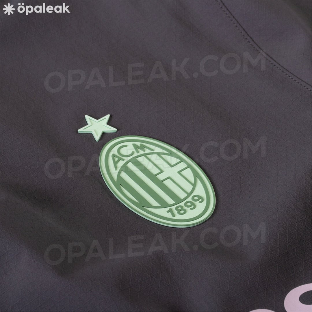
Mint green is a not a color that inspires fear. Neither does that lavender logo. Together, they are 🤢🤮
EDIT: Also, the Milan logo looks absolutely dreadful in that green. 🤮🤮🤮
BorneFree on
oof
dante_bo_bante on
When can we drop Puma? Feels like the creativity has been going the wrong direction for a bit.
Legendaarista on
Don’t get it. Atleast the 3rd kit this year was colorful and therefore sellable. This one is just bland.
Rossoneri on
I like the clean simple idea, but the mint green.. why? Basically any non-pastel color other than blue would’ve probably worked great
sickricola on
Make the green red or black or white or even gold and it becomes a decent to good third kit
ZodGlatan on
This is ugly, but at least I like the first 2 kits
TuxedoElephant on
Please no
Revolutionary-Hat297 on
Trash
SpareThisOne2thPls on
home and away kits compensate
sempreantoninho on
Am I the only one who likes this?
GISmyass on
Absolutely terrible.
DAngelo008 on
I don’t even know what colour that is but I don’t like it
Cappiuren on
I don’t dislike it
zixhei on
Jesus Christ look at that utter shit! Why mint?! It looks like a fucking hospital cleaner’s outfit.
MadsNN06 on
Wow thats nice
magma_1 on
You have the possibility of going crazy with third kits and they come up with this low effort crap…
SL_4L on
🤮
Fugim on
Shows that the new owners dgaf about Milan and it’s legacy with their obsession on color blocking our entire logo and choosing colors that are not club colors to put on our jerseys.
LavIk56 on
From the beautiful 3rd kit we had this year to this… Anyways, the home and away kits look really nice!


35 Comments
Hmm… Less spectacular than last season third kit but ok. It is clean and simple.
Wow it’s quite ugly ngl
🤨
Not great but better than this season
Rare case where i like all our kits heading into the season.
This is one of the third kits of all time
Not mad though, considering I’m already planning on getting the home, anniversary and potentially the fourth kit next season lol
Not bad, not good.
So yesterday Away kit. Today is the Thirs kit so I can assume you will post tomorrow the Home kit?
New Colgate sponsor incoming
Mint chocolate chip!
Looks ok
That mint is so ugly
Wtf is that green?
So they’ll all be good, if unexciting. The away looks great, the others are fine.
Mint green is a not a color that inspires fear. Neither does that lavender logo. Together, they are 🤢🤮
EDIT: Also, the Milan logo looks absolutely dreadful in that green. 🤮🤮🤮
oof
When can we drop Puma? Feels like the creativity has been going the wrong direction for a bit.
Don’t get it. Atleast the 3rd kit this year was colorful and therefore sellable. This one is just bland.
I like the clean simple idea, but the mint green.. why? Basically any non-pastel color other than blue would’ve probably worked great
Make the green red or black or white or even gold and it becomes a decent to good third kit
This is ugly, but at least I like the first 2 kits
Please no
Trash
home and away kits compensate
Am I the only one who likes this?
Absolutely terrible.
I don’t even know what colour that is but I don’t like it
I don’t dislike it
Jesus Christ look at that utter shit! Why mint?! It looks like a fucking hospital cleaner’s outfit.
Wow thats nice
You have the possibility of going crazy with third kits and they come up with this low effort crap…
🤮
Shows that the new owners dgaf about Milan and it’s legacy with their obsession on color blocking our entire logo and choosing colors that are not club colors to put on our jerseys.
From the beautiful 3rd kit we had this year to this… Anyways, the home and away kits look really nice!
hideous