

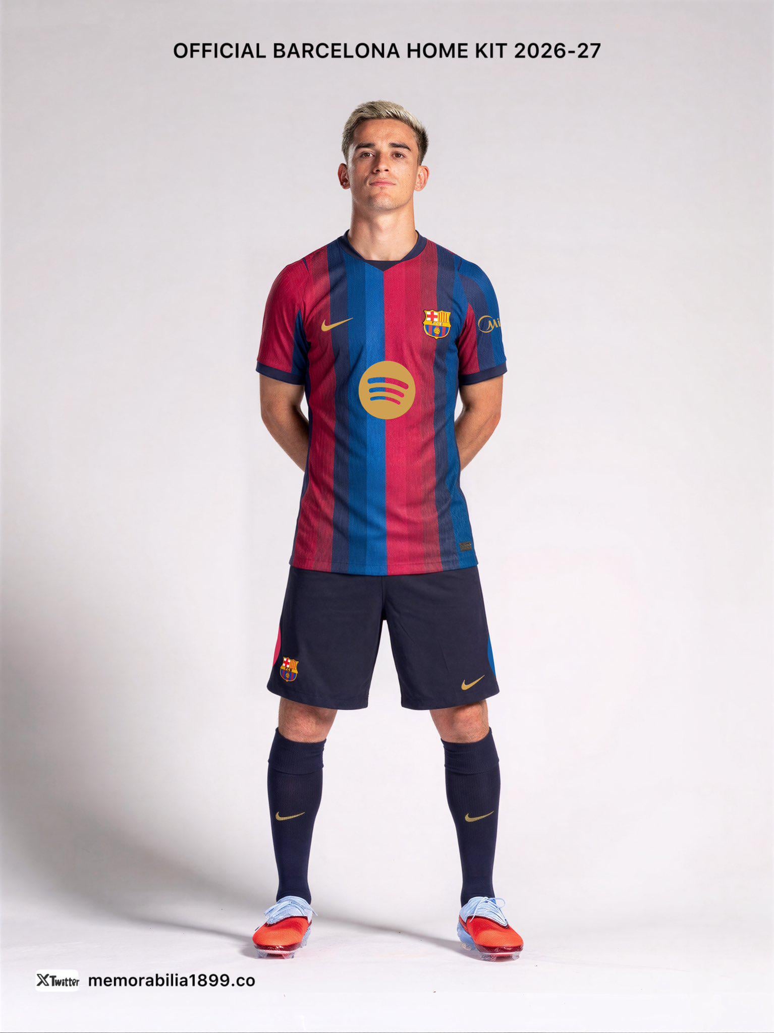
𝐁𝐀𝐑𝐂𝐄𝐋𝐎𝐍𝐀 𝐇𝐎𝐌𝐄 𝐊𝐈𝐓 𝟐𝟎𝟐𝟔-𝟐𝟕
• 𝐄𝐚𝐜𝐡 𝐬𝐭𝐫𝐢𝐩𝐞 𝐜𝐨𝐧𝐭𝐚𝐢𝐧𝐬 𝟑 𝐬𝐡𝐚𝐝𝐞𝐬 𝐨𝐟 𝐛𝐥𝐮𝐞 𝐚𝐧𝐝 𝟑 𝐬𝐡𝐚𝐝𝐞𝐬 𝐨𝐟 𝐫𝐞𝐝 — 𝐚 𝐭𝐫𝐢𝐛𝐮𝐭𝐞 𝐭𝐨 𝐭𝐡𝐞 𝐩𝐚𝐭𝐭𝐞𝐫𝐧 𝐨𝐧 𝐭𝐡𝐞 𝐫𝐞𝐧𝐨𝐯𝐚𝐭𝐞𝐝 𝐂𝐚𝐦𝐩 𝐍𝐨𝐮’𝐬 𝐞𝐱𝐭𝐞𝐫𝐢𝐨𝐫.
• 𝐈𝐭’𝐬 𝐚𝐥𝐬𝐨 𝐢𝐧𝐬𝐩𝐢𝐫𝐞𝐝 𝐛𝐲 𝐭𝐡𝐞 𝐢𝐜𝐨𝐧𝐢𝐜 𝟐𝟎𝟎𝟔/𝟎𝟕 𝐬𝐡𝐢𝐫𝐭, 𝐰𝐢𝐭𝐡 𝟒 𝐦𝐚𝐢𝐧 𝐬𝐭𝐫𝐢𝐩𝐞𝐬 𝐚𝐜𝐫𝐨𝐬𝐬 𝐭𝐡𝐞 𝐟𝐫𝐨𝐧𝐭.
• 𝐓𝐡𝐞 𝐩𝐫𝐞𝐬𝐞𝐧𝐭𝐚𝐭𝐢𝐨𝐧 𝐨𝐟 𝐭𝐡𝐞 𝐧𝐞𝐰 𝐡𝐨𝐦𝐞 𝐤𝐢𝐭 𝐟𝐨𝐫 𝐭𝐡𝐞 𝟐𝟎𝟐𝟔/𝟐𝟕 𝐬𝐞𝐚𝐬𝐨𝐧 𝐢𝐬 𝐞𝐱𝐩𝐞𝐜𝐭𝐞𝐝 𝐢𝐧 𝐦𝐢𝐝-𝐉𝐮𝐥𝐲 𝟐𝟎𝟐𝟔
by PinReal4448
42 Comments

The 3 kits are amazing
I like it
Idk man I’m kinda conflicted on the home kit
Dont know about yall , but i love every three of em
Beautiful
What sponsor is that on the sleeve?
how tf are y’all liking ts. this looks like ass
Ummm dont know how i feel about this

I like it!
Love the shorts
How is it the official home kit if it’s posted by some random account on Twitter?
the spotify logo looks misalligned
too many colors I hate it, 3 are max
the shorts and socks should have the same blue or red of the shirt
At a glance it looks nice but if I look too much into it it starts to resemble those pinterest colour palletes and idk how I should feel about that.
C tier
Ugly tbh
Feels like I’m looking at the start of a Netflix show… the shorts are dope
Blaublaublaugranagranagrana
Nike keeps screwing Barca over and the Spotify logo dont help matters
so clean love it
Official kit with unofficial tag?
Its beautiful
Prettiest shades
I like it, just hope Nike fixes the shoulder issue it’s had on the NT kits
Meh

I like it, but I also don’t like it.. idk
My boi Gavi looking like he’s constipated
Looks class
Looks like the Netflix start up screen
Banger. Absolute banger

Stop with the degrading or degrading effect patterns!
Keep it simple, Nike.
Reminds me of the 22/2023 kit, I personally don’t see a resemblance to the 06/07 kit myself tbh. That said, it’s alright. We survived the checkered jersey and monstrosity of 21/22
It doesn’t look like it’s symmetric
Just give me the half and half red and blue man.
I’m a little tired of the gradients. I preferred the special edition 4th kit this year.
i like it

Bring back the Meyba kit! 🥹
Would’ve been so much better if the right sleeve was blue and the left sleeve was red
Would have been better without the three gradients of red and blue on each stripe