

No club football got me bored…
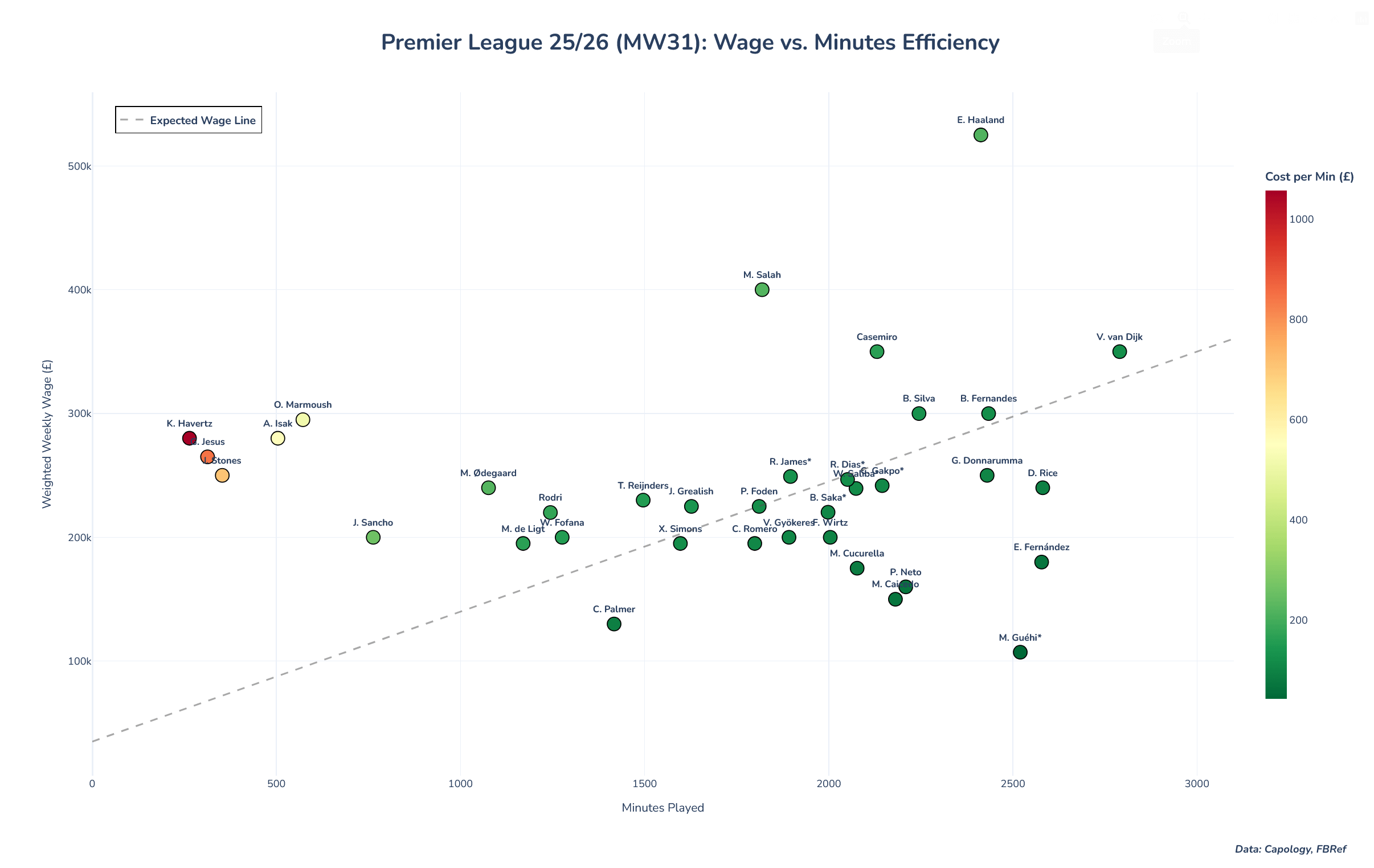
…so I drew up this chart in Python using data from FBref and Capology, and it encompasses the most paid players amongst the Big 6 in the Prem. Generally, players are "expected" to follow the dashed line. Apart from some anomalies here like Haaland, Salah, Casemiro and Guéhi, players below the line are generally more cost-efficient than those above the line. Here are some insights I found interesting, as well as some notes:
- On that point, the following players have had mid-season contract changes: Saka, Saliba, Gakpo, Dias, Romero and Reece James (his weekly salary went down). These have been accounted for.
- Naturally, you'd expect defenders and keepers to play the most minutes but VVD plays so many minutes. He's the closest to having a "fair value" according to this graph.
- The reds and yellows: Marmoush, Havertz, G. Jesus, Stones and Isak. We know that they've been injured but I mean… they're still getting paid right?
Anything you notice? This is my first time making a graphic like this but I think it's very interesting to see if your club getting value for money from your players. May remake this for all players in the league, too.
by vonChristie
4 Comments
So weird, I thought there were twenty teams in PL with at least 11 players per team, I’m impressed how you got a minimum of 220 people on this one chart..
Or there’s some selection bias going on for which players are included
Can’t believe Palmer is paid lower than a lot of those players. 🤯
Pull out the outliers and the trend line is actually negative – the more you’re paid the fewer minutes you play!
Value Van Dijk!