
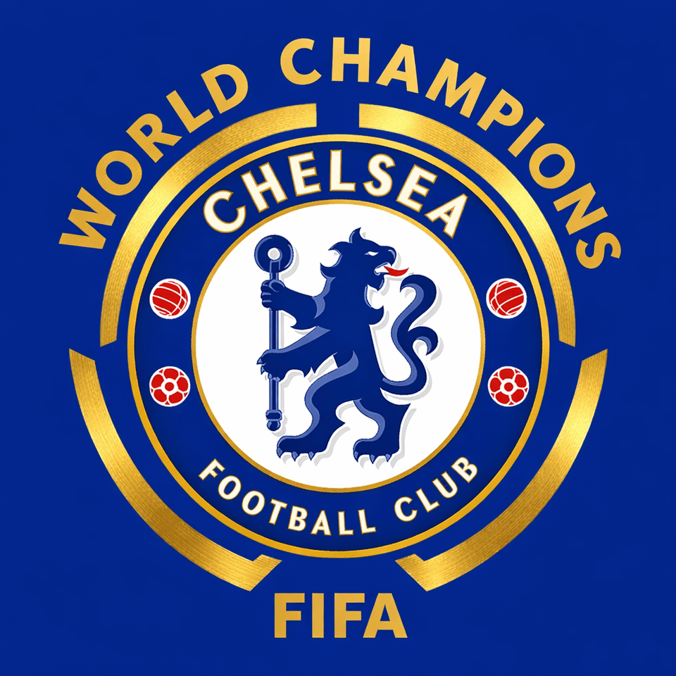
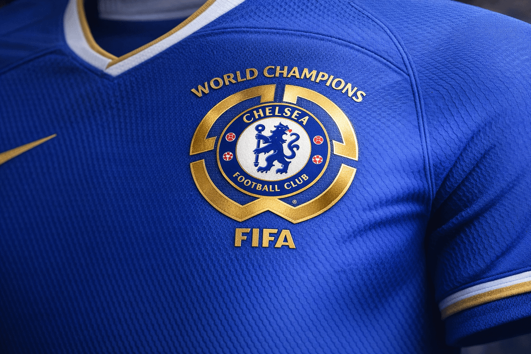
I think a majority of us agree that the current badge is an eyesore on all our kits especially the third kit because of it's awkward circular design and positioning. That's why I thought of this alternate concept of a badge that has the trademark CWC crown trademark around our crest that's simple and gives off a regal look. I think its a unique design which will be interesting to use for the next 4 years.
What is everyone's thoughts on this?
by pizza__irl
8 Comments
Personally I quite like your design above the current crap! Nice job
Aren’t there rules concerning the badges on kits the players are wearing?
This concept would look so good on a kit I might wear and I like the design
I personally like it a lot and prefer it to the current, round nondescript badge plonked in the middle
This feels like an elaborate expansion on the national team system of adding a star above the crest, which is obviously not something you can do in the club game because so many clubs and leagues have their own star codex to celebrate other things already
Edit – also it incorporates the actual trophy as well
The old shield badge on the sleeve was perfectly fine of course
This is a million times better than the official one. This is elegant and retains a lot of blue. I wish we had your logo on the official kits.
That’s actually pretty sick.
Looks great – but unfortunatley probably breaks regulations
Very cool … If only worn during the next CWC.
For half a second I was wondering why the lion had an eagle beak.. but I take it the AI didn’t quite reproduce the crest in a fully correct way.
I like the concept though! Much cleaner and fancier looking than the actual badge.