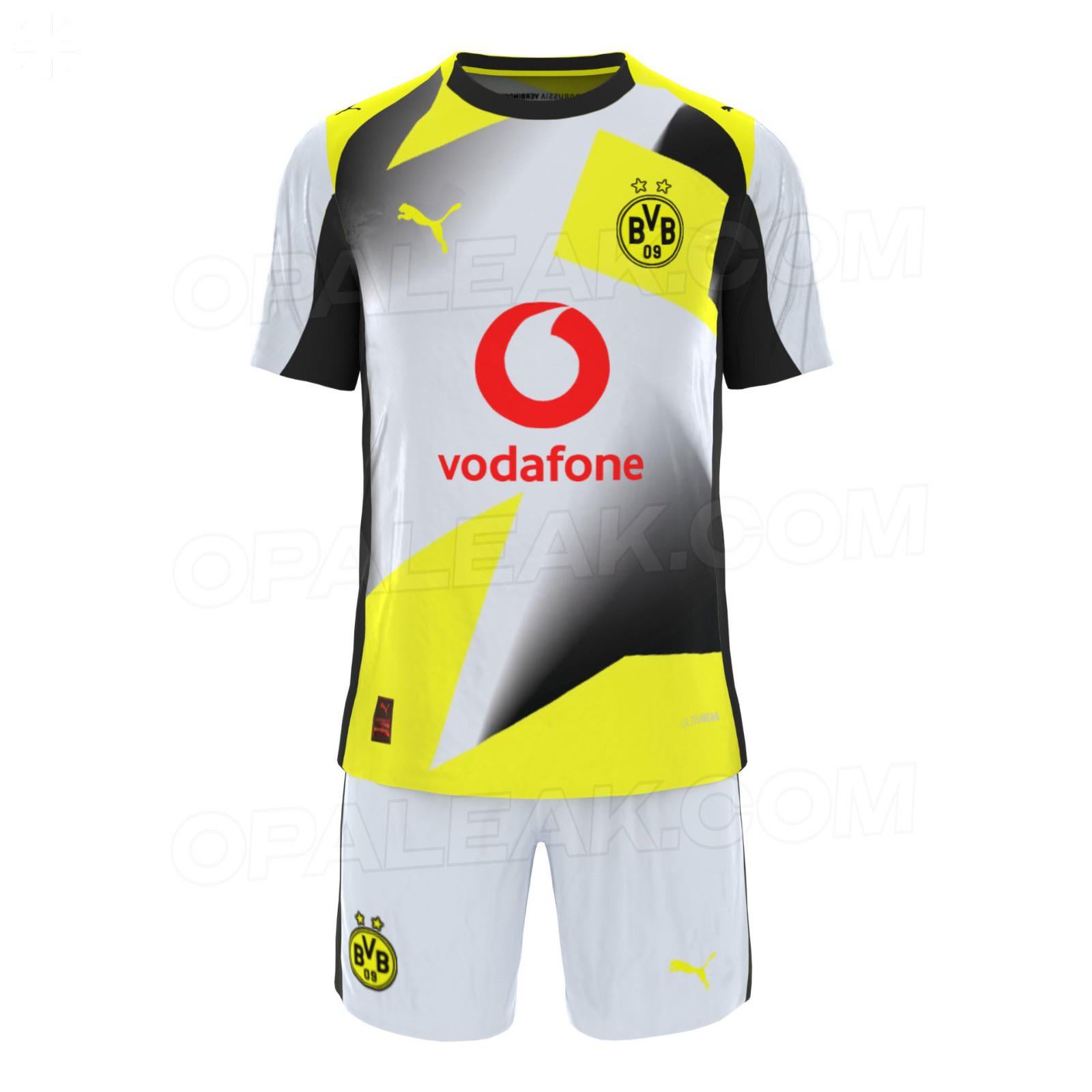
Looks like someone locked an intern in a room with MS Paint and leftover fabric scraps. It’s less football jersey, more like discount esports merch. My God! Even the Herne-West jerseys look better.
RDR2Enjoyerr on
they somehow managed to make a jersey that looks even worse than our 2021/22 cup jersey
GuenW on
Apart from the ugly design, the club colours are black and yellow. White, silver or whatever jerseys shouldn’t exist. If it’s a third kit that you have to have, it’s something different but a regular away kit, should always be black
ontilein on
Switch the Red to Black and im fine with it
Wafey on
This is me and literally every jersey from any other clubs are the guy she tells me not to worry about
BogOBones on
Not good, but the red really makes it trash.
Impressive-Bank-6650 on
This shit is ass!
eeeeeeeelleeeeeelll on
I‘d rather wear a Schalke kit than that…
blanklikeapage on
I do wonder how something like this can be accepted. Everyone who looks at it would agree, that it doesn’t look good. Is it just one guy having too much influence on pride so no one can tell him no? There had to be better designs, right? Well, at least one less kit to buy.
KaiRee3e on
Yes, you’re all wrong.
This kit is unironically fire, and people are sleeping on it
BVBUSA32 on
Sort of par for course with most aspects of the club sadly.
polyphobicDE on
Disgusting.
Embarrassed-Base-143 on
Hideous, they’d have to pay me to wear that
Namenlos13 on
No
Zwodo on
Reminds me of the iconic Vodafone Formula 1 car, so I’m almost inclined to like it a little. Almost. Doesn’t really mingle all too well though, but I’ll wait to see what it looks like without the watermarks and terrible quality. And ultimately in person. Like the 23/24 cup jersey which I absolutely loved, that looks underwhelming in pictureds.
Designer_Ad_245 on
Pretty dog shit. Idk what’s worse this or last years UCL kit.
ebuennag09 on
Involuntary screeching noise
t_mmey on
yikes on trikes
LGeCzFQrymIypj on
About as bad as the club these past years
KaizenBaizen on
🤮
Hot-Confusion1860 on
This has serious 90s bus seat pattern vibes.
Working_Complex8122 on
it looks like we play. It’s perfect.
Questy-McQuestface on
The same procedure as every year in Dortmund. At least one of the jerseys makes me throw up.
LEICSTAR on
PUMA obviously hates the BVB! ☝️🧐
florianowitch on
Since the 90s we Never looked more 🤡 ish than the last few years 🥹


27 Comments
Bad
Looks like someone locked an intern in a room with MS Paint and leftover fabric scraps. It’s less football jersey, more like discount esports merch. My God! Even the Herne-West jerseys look better.
they somehow managed to make a jersey that looks even worse than our 2021/22 cup jersey
Apart from the ugly design, the club colours are black and yellow. White, silver or whatever jerseys shouldn’t exist. If it’s a third kit that you have to have, it’s something different but a regular away kit, should always be black
Switch the Red to Black and im fine with it
This is me and literally every jersey from any other clubs are the guy she tells me not to worry about
Not good, but the red really makes it trash.
This shit is ass!
I‘d rather wear a Schalke kit than that…
I do wonder how something like this can be accepted. Everyone who looks at it would agree, that it doesn’t look good. Is it just one guy having too much influence on pride so no one can tell him no? There had to be better designs, right? Well, at least one less kit to buy.
Yes, you’re all wrong.
This kit is unironically fire, and people are sleeping on it
Sort of par for course with most aspects of the club sadly.
Disgusting.
Hideous, they’d have to pay me to wear that
No
Reminds me of the iconic Vodafone Formula 1 car, so I’m almost inclined to like it a little. Almost. Doesn’t really mingle all too well though, but I’ll wait to see what it looks like without the watermarks and terrible quality. And ultimately in person. Like the 23/24 cup jersey which I absolutely loved, that looks underwhelming in pictureds.
Pretty dog shit. Idk what’s worse this or last years UCL kit.
Involuntary screeching noise
yikes on trikes
About as bad as the club these past years
🤮
This has serious 90s bus seat pattern vibes.
it looks like we play. It’s perfect.
The same procedure as every year in Dortmund. At least one of the jerseys makes me throw up.
PUMA obviously hates the BVB! ☝️🧐
Since the 90s we Never looked more 🤡 ish than the last few years 🥹
If I only see those warmup dresses 🤮
Makes my bvb heart feel bad..
Brother uhhhh whats that ?