Was this made on Dream League Soccer? Seriously who’s the creative mind behind this horror?
letsnevertalk on
i hope this is not real, i find it very very ugly
Working_Complex8122 on
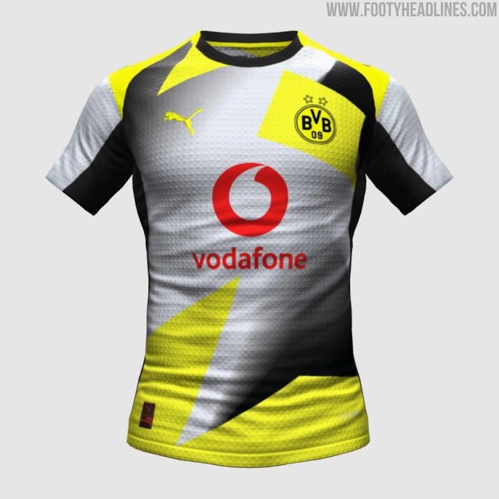
why white with yellow though? Why not black with a shade of silver or something? yellow in away makes no sense.
furiat on
Ouch my eyes 😉
Similar-West5208 on
please no
enelfOu on
Getting worse 😀
Horror-Zebra-3430 on
thanks i hate it
PrettyMetalDude on
Looks slightly better than the last leak but still very much an eyesore. We should just play in white when possible.
santa_94 on
Slightly better than the shirt that surfaced a few days ago, still terrible tho 😅
walruswaspaul123 on
Atrocious
Tribe_KPtG on
oh god no
trashscorer on
Gives me few Manchester United van Nistelrooy vibes
dofri69 on
Surely this is a joke
ysn80 on
Wasn’t this posted yesterday?
2 things:
1.original color on the away jersey?
2 sponsor logo in red?
I am still not convinced until itvis offical
blanklikeapage on
Someone saw the cup kit from this season, heard it described as “can’t be worse than that” and thought bet.
Careless_Award_837 on
Fuuuuuuckkk
Mysterious_Tax_9825 on
What the fuck is this…
The only positive is that we don’t wear away jerseys that often so maybe we’ll not see it that much thankfully…
Ibar09 on
I can prompt chatgpt to generate a better kit than this.
ontilein on
I like it but i usually like those crazy ugly&unique jerseys anyways.
But given that the home jersey is already pretty adventurous, a more traditionel away kit would have been better
Jon98th on
Awful … looks like a bad training kit
sniffko on
🤮🤮🤮
anxxous on
what the fucking fuck…
rotiza on
Fuck puma. Thats a joke
bennetpious on
Horrendous
bennetpious on
Since their brand refresh they try hard to become an esports team in real life.
KaiRee3e on
unpopular opinion, but I lowkey like it
the silver saves it
patriarhsector5 on
Hopefully the other 5% is used for the betterment of humanity
patriarhsector5 on
I wish that we had agreed to the Red Vodafone logo on the home kit to avoid this monstrosity
FUCK COMPROMISES
withoutpicklesplease on
So wait… Vodafone and the club made a whole PR camping saying “of course the logo will be black” just to STILL put a red logo on our jersey. This is ridiculous!
Firm-Gas7063 on
The concept is actually kinda good it’s just they chose the worst possible coloring

32 Comments
Was this made on Dream League Soccer? Seriously who’s the creative mind behind this horror?
i hope this is not real, i find it very very ugly
why white with yellow though? Why not black with a shade of silver or something? yellow in away makes no sense.
Ouch my eyes 😉
please no
Getting worse 😀
thanks i hate it
Looks slightly better than the last leak but still very much an eyesore. We should just play in white when possible.
Slightly better than the shirt that surfaced a few days ago, still terrible tho 😅
Atrocious
oh god no
Gives me few Manchester United van Nistelrooy vibes
Surely this is a joke
Wasn’t this posted yesterday?
2 things:
1.original color on the away jersey?
2 sponsor logo in red?
I am still not convinced until itvis offical
Someone saw the cup kit from this season, heard it described as “can’t be worse than that” and thought bet.
Fuuuuuuckkk
What the fuck is this…
The only positive is that we don’t wear away jerseys that often so maybe we’ll not see it that much thankfully…
I can prompt chatgpt to generate a better kit than this.
I like it but i usually like those crazy ugly&unique jerseys anyways.
But given that the home jersey is already pretty adventurous, a more traditionel away kit would have been better
Awful … looks like a bad training kit
🤮🤮🤮
what the fucking fuck…
Fuck puma. Thats a joke
Horrendous
Since their brand refresh they try hard to become an esports team in real life.
unpopular opinion, but I lowkey like it
the silver saves it
Hopefully the other 5% is used for the betterment of humanity
I wish that we had agreed to the Red Vodafone logo on the home kit to avoid this monstrosity
FUCK COMPROMISES
So wait… Vodafone and the club made a whole PR camping saying “of course the logo will be black” just to STILL put a red logo on our jersey. This is ridiculous!
The concept is actually kinda good it’s just they chose the worst possible coloring
Oh God.
idk i like it