
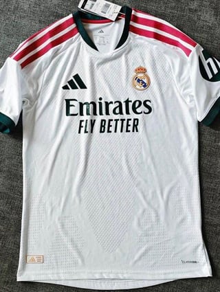
Always a pleasure when they incorporate color into a jersey. I think it's the best looking kit we've had since the 23/24 season. The pattern elevates the overall design without taking away from the clean look. Same with the color combination. Good stuff, Adidas. Here's to finally winning trophies again.
by ssZuke
28 Comments
I sincerely hope this is fake.
Its an eyesore. But if the team wins trophies in it, it’ll look better.
Duality of man
https://preview.redd.it/5gsvxthy0dwg1.jpeg?width=1125&format=pjpg&auto=webp&s=e6c4afde4e1f33f282ed7a30891b945626f449c0
Lol
Ugly
Looks good but this one is giving Man Utd vibes and i’m afraid of that
As a jersey collector, I don’t hate it….But I’m more keen on the away( green) kit and also the third kit( pink)
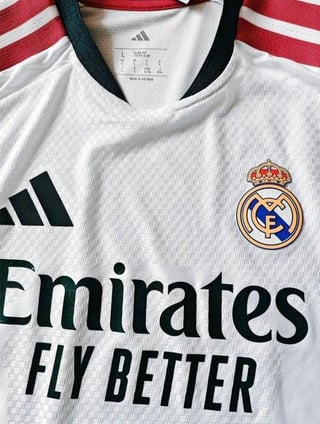
The lines on shoulders are not black٫ LET’S GOOOOOOOOO
Yay another kit for me to not buy
It’s terrible.
Esto es una atrocidad increíble
Ugly
This looks like something United or Liverpool would have for their away kit.
it’s not representative of real madrid in the slightest but i do like the colors.
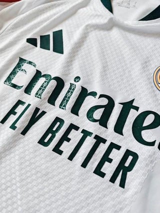
another thing i like is how they used the green and the pink separately to make the second and third kit. it’s a lot better than just making both of those different shades of the same color lol
Thats one ugly kit
It’s awful. Those stripes should be gold.
Yayy a non Vini Mbappè hate post. Thank you.
I don’t like the pink. Wish it was all dark green. First time we are having green in our kit as far as I can remember
Home kit history:
25/26 – Black (yellow)
24/25 – Black
23/24 – Blue (yellow again)
22/23 – Purple
21/22 – Blue (orange)
20/21 – Pink (!!)
19/20 – Yellow (gold)
18/19 – Black
17/18 – Blue (Teal?)
16/17 – Blue
15/16 – Grey (nothing)
14/15 – Black (pink line?)
13/14 – Black (Orange)
12/13 – Blue
11/12 – Yellow (gold)
10/11 – Blue
09/10 – Black (yellow)
Atrocious
Mid
Kinda looks clownish lmao wtf. In par with the management lately.
aint buying that shit
nah son adidas can keep this one
Probably our worst jersey ever

Noo !!!! tf is this shit…..
this looks like another season trophyless kit
cant lie, i love the green notes, if only they made the adidas stripes the same color and added pink notes to the bottom of the shirt instead, the pink stripes do make the shirt more polarizing
Wtf are those colors? Not even related to Real Madrid
Truly terrible and an insult to the badge
No Black on stripes, we are winning it all mext season