

June 8, 2026 Updated 1:12 am EDT
This article is part of our Style of Play series, an exploration of World Cup kit culture.
The men’s World Cup will be many things: searing elite-level competition, a monument to hypercapitalism and, for better or worse, a fashion show.
With an expanded 48-team tournament comes an expanded catalogue of football shirts for eyeballs to feast upon over the course of 37 days.
There will be radical designs both evoking days of yore and shaping the zeitgeist with fresh, modern twists — and The Athletic’s Nick Miller is here to rank every home strip.

(Julio Aguilar/Getty Images)
Ah. Hmmm. No. You can understand the temptation to play around with an established design but playing around with the iconic Croatia checkerboard is an absolute high-wire act and regrettably, Nike have tumbled from the tightrope with this one. The squares are too small for a start and that’s before you get to the stupid white bit down the middle: it looks like someone has tried to edit this on their phone, got halfway through colouring it in white, and then became bored. No.
Photo:
(Julio Aguilar/Getty Images)
(Julio Aguilar/Getty Images)

(Jeff Vinnick/Getty Images)
Here’s the most damning thing you could say about this to a Canadian: this looks like the sort of shirt an American would design. Take a national symbol, remove all semblance of subtlety and make it massive, then splatter it all over the body of the shirt. The maple leaf isn’t so much the design on this shirt — it is the shirt, and it simultaneously manages to look brash and boring. Some feat.
Photo:
(Jeff Vinnick/Getty Images)
(Jeff Vinnick/Getty Images)

(Vincent Carchietta/Getty Images)
The Puma blurb for this shirt declares that it “honours the heroes of ’96”, which is fine… only this shirt looks absolutely nothing like the one the Czech Republic wore to reach the final of the 1996 European Championship. The shade of red is different, the shade of blue trim is different, the collar is different and the ’96 shirt had a thick white and blue stripe down the sleeve. Other than that, it’s bang on. If you squint, it’s possible that this ‘honouring’ comes on the small pattern on the cuffs, which might be similar to the one on the ’96 sleeves… but that’s a stretch. Shorn of that irritation, it’s just quite a dull shirt.
Photo:
(Vincent Carchietta/Getty Images)
(Vincent Carchietta/Getty Images)

(Ira L. Black/Getty Images)
Not much to say about this, is there? It’s… just a yellow shirt. Which immediately lends it some kudos, given the relative rarity of the colour in football, but otherwise there’s not much going on here. There is some blue and red marbly business going on down the sides, which lends it some visual variety, but not much. What else… the collar is quite nice? It’s not bad, it’s just not terribly interesting.
Photo:
(Ira L. Black/Getty Images)
(Ira L. Black/Getty Images)

(Puma)
Probably the funniest kit at this World Cup, broadly because, as I wrote in the AFCON rankings when discussing their previous shirt, it looks like in their attempts to incorporate some iconic imagery related to the nation in question, Puma just opened Egypt’s Wikipedia page and sagely noted that they have pyramids there. But they have also somehow managed it look like those Facebook memes about the Illuminati. All of which doesn’t necessarily make it a terrible kit… just quite a funny one. Which probably isn’t what they were going for.
(Puma)

(Saeta)
At first glance, you’re suspicious of a design where the manufacturer’s logo is more prominent than the team/country’s. And then at second glance, there’s an unusual design on the belly/hip area, which seems to be a group of men holding a flag on a mountain somewhere. Apparently It references the Battle of Vertieres in 1803, the final engagement of the Haitian Revolution against Napoleon’s forces, but without wishing to insult a nation, from a purely aesthetic point of view… it looks a bit weird.
(Saeta)

(Roy Lazet/Soccrates/Getty Images)
It’s a fine line between bold and garish when you have an orange kit, and it feels like this one has tipped into ‘hi-vis apron’ territory, rather than ‘iconic Oranje remembering the great sides and players of Dutch past.’ It looks like the sort of thing that someone who cycles to work buys after their partner nags them into wearing something less likely to get them hit by a van. I’m also in the camp that the Netherlands should always be clad in orange and white, rather than orange and black, but they haven’t had one of those kits since 2014, so that feels like a losing battle. The design itself is fine, if a little boring, it’s just the colours that make it an eyesore.
Photo:
(Roy Lazet/Soccrates/Getty Images)
(Roy Lazet/Soccrates/Getty Images)

(Bas Czerwinski/ANP via Getty Images)
This is the same home jersey that Algeria wore at this year’s AFCON and the passage of time hasn’t made me any more keen on this one. The thick stripes down the sleeves and the green colour are both nice, but the three light-brown smears down the chest still make it look like they’ve been playing in a dirty puddle. In fact, they look like tire tracks, like some massive monster truck has driven over whoever is wearing the shirt. An omen for Algeria’s chances at the tournament? Well, no, but it still looks weird.
Photo:
(Bas Czerwinski/ANP via Getty Images)
(Bas Czerwinski/ANP via Getty Images)

(Chris Arjoon/Icon Sportswire via Getty Images)
The problem with having a black shirt and wanting to keep the design relatively minimal is that when you do include a background design of some sort, it’s quite difficult to avoid making it look really shiny. So it will probably look like someone has thrown a bucket of water across Chris Wood’s torso every time he and his colleagues take to the field. It’s also quite difficult to make out what the design is: for reference, it’s the New Zealand national symbol, the Silver Fern, but if you needed a snarky kit reviewer to point that out, it probably hasn’t quite worked.
Photo:
(Chris Arjoon/Icon Sportswire via Getty Images)
(Chris Arjoon/Icon Sportswire via Getty Images)

(Adidas)
Look, we’re not saying that Adidas didn’t expect Qatar to qualify for this World Cup and thus had to act pretty quickly to get their kit ready when they did… but this shirt does just seem to be the Adidas template with the motif from the national flag down the middle. Which doesn’t necessarily make it bad, just, you know,maybe not the most imaginative design you can think of. Still, according to the Adidas website, it is “your companion for showcasing your love for football and the spirit of Qatar”, if you were looking for such a companion.
(Adidas)

(Alex Goodlett/Getty Images)
“The head-to-toe camo print embodies an ambush of tigers striking together at any moment,” boasts the Nike website about this South Korea shirt. OK guys, chill out a bit, yeah? To me, that doesn’t look like camo, it looks like whoever wearing it is fresh from quite a dramatic crime scene, and haven’t got round to changing their bloodied shirt, thinking that the red colour will keep them safe. Dramatic can be good, but this feels a bit too dramatic.
Photo:
(Alex Goodlett/Getty Images)
(Alex Goodlett/Getty Images)

(Marco Steinbrenner/DeFodi Images/DeFodi via Getty Images)
There can’t be many kits at this World Cup that are inspired by what amounts to admin/paperwork, but let’s be honest… if it was going to be anyone, it would be Switzerland. The Puma sell for this shirt proudly declares the jersey is inspired “by the nation’s futuristic passports”. Cool! What next: insurance documents? Parking permits? Planning permission forms? It also claims to embody “discipline and freedom simultaneously”, which does feel a bit like someone trying to persuade you that “the rules make the fun”. Ultimately, even if you ignore all of this nonsense, it’s just quite a forgettable kit, which is a shame.
Photo:
(Marco Steinbrenner/DeFodi Images/DeFodi via Getty Images)
(Marco Steinbrenner/DeFodi Images/DeFodi via Getty Images)

(Nike)
Hmmm. That design looks like a school art project, that thing where you put a load of paint into a tray, swirl it around for a bit then dip a piece of paper in it. It hangs on the fridge for a few years until you bring a boy/girlfriend home for the first time, at which point it’s thrown in the bin out of pure, uncut embarrassment. Your parents humiliate you in front of them anyway. Anyway, that’s what Turkey, perhaps one of the most exciting young attacking teams at the tournament, at their first World Cup since 2002, will be wearing this summer. Pity.
(Nike)

(Visionhaus/Getty Images)
I confess I laughed out loud when I read the description of this shirt on the Nike website, which is a masterclass in vagueness: “This design is an homage to classic Uruguayan kits through the years.’ Not an homage to any kit in particular, just “kits through the years”, which does make it sound like they left this one to last and had to rush it. Which they almost certainly didn’t, because it’s a pretty nice, if plain and simple design. One criticism would be that the dark blue trim is so minimalist/subtle that you’re left peering at it slightly, wondering if it’s just a shadow or whether they actually did intend to add that detail. Still, when it’s just “kits through the years”, you can pretty much make your own rules.
Photo:
(Visionhaus/Getty Images)
(Visionhaus/Getty Images)

(Uzbekistan FA)
7Saber, the local company designing Uzbekistan’s gear for their first ever World Cup appearance, seem to usually manufacture the sort of casual sportswear that you might associate with Paulie Walnuts from The Sopranos. So it’s a big “whadderya hear, whadderya say?” to this design, which… is fine. Fairly uninspiring, relatively plain with a bit of a jazzy background pattern, inspired by various elements of Uzbek culture. The launch video was pretty good, with the shirts coming to life in the factory, running through Tashkent before flying up to a plane with their players aboard and jumping onto their torsos.
(Uzbekistan FA)

(Severin Aichbauer/SEPA.Media/Getty Images)
This is a bit of a departure, because as far as I can tell, Austria have never had a red and black design as their home shirt in their history: they have flitted between white and red as their main home colours down the years, but when it’s the latter, it has tended to be mainly red with white trim. Little bits of black have made an appearance, but not like this, with the full sleeves. It’s quite striking, although I’d probably hesitate to call it actively nice.
Photo:
(Severin Aichbauer/SEPA.Media/Getty Images)
(Severin Aichbauer/SEPA.Media/Getty Images)

(Puma)
This is a bit of a departure for Senegal since typically, their home shirts are fairly bold — white with a solid green (and yellow and red) presence. But this one takes a slightly softer approach, with a background design featuring a range of pastel colours. And in the opinion of this kit-ranker at least, it doesn’t work. You can see what they’re going for but ultimately, it just looks like a T=shirt you bought in 2007 and has been washed a billion times so the pattern has faded, but for personal reasons you can’t bring yourself to throw out.
(Puma)

(Bosnia National Team)
Kelme is not a brand you necessarily associate with elegant design, more slightly low-quality looking kits on mid-range Spanish teams. But this is rather good: yellow offers quite a nice contrast colour to the deepish blue and they’ve used it subtly here on the broken pinstripes down the front, and on the collar and cuffs. There is a fundamental problem though with any Kelme kit, which is their logo: it is indeed a paw, which, according to their corporate branding is “more than a symbol, it is an attitude”, but ultimately just makes anything they produce look like a promotional T-shirt for a pet shelter.
Photo:
(Bosnia National Team)
(Bosnia National Team)

(Adidas)
I can’t quite put my finger on what but there’s something not quite right with this. Could it be the pattern on the sleeve, which is reminiscent of Kaa the snake’s eyes when trying to hypnotise Mowgli in Disney’s Jungle Book film from the 1960s? Is it something to do with the collar? Is it just the colour of the main body of the shirt? I think probably the latter: it’s not terrible, just… a little off. Too… almost purple. Maybe there’s nothing wrong with the shirt, and it’s me that’s the problem. A sobering thought.
(Adidas)

(Morteza Nikoubazl/NurPhoto via Getty Images)
Here’s something you may not have known: the population of Asiatic cheetahs in Iran has leapt up in the last year. As this article explains, this is a source of national pride and hope in what has otherwise been a pretty grim time. This isn’t the first time the animal has featured on the Iran kit: its spots have popped up on their sleeves before, but emblazoning the head and of one on the stomach of the shirt is quite a bold statement. And it needed to be really, to make this otherwise completely plain shirt stand out a bit.
Photo:
(Morteza Nikoubazl/NurPhoto via Getty Images)
(Morteza Nikoubazl/NurPhoto via Getty Images)

(Marco Steinbrenner/DeFodi Images/DeFodi via Getty Images)
“This is more than just sportswear,” boasts the Kelme website, but rather a “monument to the historic journey” of the Jordanian national team and its “resilience through elite athletic performance”. It must be so much fun writing those blurbs: perhaps they get particularly intense out-of-work poets to do them. As for the shirt itself, it feels like someone has really taken the “plain white shirt with some red on the shoulders” brief for a hell of a walk, with the geometric patterns on those sleeves original at least, even if there’s a sense that it doesn’t quite work.
Photo:
(Marco Steinbrenner/DeFodi Images/DeFodi via Getty Images)
(Marco Steinbrenner/DeFodi Images/DeFodi via Getty Images)

(Mateusz Slodkowski/Getty Images)
This is essentially the same design as the Norway kit from around 1997 but it does feel slightly strange calling this a retro tribute number when it’s literally the national flag, transposed onto a football shirt. It’s certainly extremely striking and seems to be popular: at the time of writing, it has completely sold out on the Nike website. Although you could say that’s probably enthusiasm for Norway’s first World Cup 28 years, rather than enthusiasm for Nike’s flash of inspiration.
Photo:
(Mateusz Slodkowski/Getty Images)
(Mateusz Slodkowski/Getty Images)

(John Dorton/USSF/Getty Images)
You can see what they’re going for here, a tribute to the home shirt the USMNT wore the last time they hosted a World Cup in 1994, but with horizontal rather than vertical stripes. And it’s fine, even if it does look more like the away shirt of an English League Two team than one for a side at the biggest tournament in football. Subtle though, it is not, especially when you read the description from Nike. “Undeniably American” they announce, not exactly dispelling the notion that to an outsider the American sense of patriotism seems remarkably insecure if they have to keep yelling about it this much. “Proudly red, white and blue, this USA jersey features wavy stripes that remind your team of their flag flying high,” it continues. Because America is famously a country where it’s easy to avoid the national flag. Still, decent shirt.
Photo:
(John Dorton/USSF/Getty Images)
(John Dorton/USSF/Getty Images)

(Jako)
The official word from Jako, the manufacturers of this Iraq shirt, is that the pattern on the background of this shirt “incorporates classic Iraqi patterns, giving the design a unique, culturally inspired look”. That may be the case but it does sort of look like a few of those games your aunt plays on her iPad stacked up on top of each other. Looking past that, there is quite a good ‘no frills’ vibe to this one: you don’t often get shirts that are basically just black and white (with a few tiny bits of red) these days, so if it’s fairly basic you’re after, then this is for you.
(Jako)

(Carmen Mandato/Getty Images)
The patterns on the sleeves of this belatedly announced Tunisia kit are inspired by the animal that provides the team their nickname: the Eagle of Carthage. That is undeniably cool but you can’t help thinking that they’ve wasted this terrific motif by choosing light grey as the ‘contrast’ colour for a white shirt. If they had gone with, say, red, then it would have stood out and been much more striking. As it is, you can barely make out what the pattern is supposed to be. Shame.
Photo:
(Carmen Mandato/Getty Images)
(Carmen Mandato/Getty Images)

(Ulrik Pedersen/NurPhoto via Getty Images)
A lot has changed since DR Congo were last at the World Cup 52 years ago. The name of the country for one, their home shirt colour another: back then Zaire wore green, with a quite cool massive leopard in the middle of the chest, albeit the edge of that coolness is taken off a little by the fact it was partly designed by Mobutu Sese Seko, the dictator at the time. As far as we’re aware, no tyrants were involved in putting this one together: I put this pretty low in the most recent AFCON rankings but it’s grown on me in the interim.
Photo:
(Ulrik Pedersen/NurPhoto via Getty Images)
(Ulrik Pedersen/NurPhoto via Getty Images)

(Puma)
For the Club World Cup last year, Puma released a series of maverick designs, some of which worked and some of which emphatically didn’t. But you had to admire their willingness to try something a little different, and when that ‘trying something different’ is refined a bit, you get a design like this Paraguay shirt. The ‘spray can’ stripes will not be popular with everyone, but they do offer a point of difference without being too wacky.
(Puma)

(Agustin Cuevas/Getty Images)
Why yes, since you ask, the wavy patterns on this shirt are “a nod to the country’s maritime roots and fearless spirit”. You could point out that those “maritime roots” often resulted in them colonising a bunch of the countries that will also be at this World Cup but perhaps that would be a touch churlish. Historical deep dives aside, this is pretty nice — not great, but pretty nice, fairly clean and just the right side of boring. The main quibble is the maroon shorts: for me, the Portuguese should always be green from the waist down but perhaps it’s a nod to their victorious Euro 2016 campaign, like a superstitious fan insisting on wearing their lucky underpants. Even kit designers can leave things to the gods.
Photo:
(Agustin Cuevas/Getty Images)
(Agustin Cuevas/Getty Images)

(Jonathan Nackstrand/AFP via Getty Images)
No frills here: it’s a Sweden kit, it’s Adidas, so it’s bright yellow, it also has bold blue, it’s three white stripes down the sleeves, bish, bash, bosh, done. Which, really, is what you probably want from a Sweden kit: the colours mean you don’t have to do much to make it stand out, so while you can’t go this basic every time, it’s a sensible choice. It also strikes a decent balance between referencing a kit from the past (their Euro 2000 design, with the block blue sleeves) without it being a direct copy.
Photo:
(Jonathan Nackstrand/AFP via Getty Images)
(Jonathan Nackstrand/AFP via Getty Images)

(Adidas)
The Adidas blurb for this shirt claims it’s a “nod to the kits the team wore” when they hosted the World Cup in 2010: judge for yourself, but that does seem a bit of a stretch, other than the fact it’s the first tournament at which Adidas have designed the Bafana Bafana shirt since then. That aside, this is great. The green really pops from the yellow and is thus used suitably sparingly, and the repetitive background pattern does the job of jazzing up an otherwise fairly basic shirt.
(Adidas)

(Fepafut)
“Reebok…” the middle-aged football kit reviewer muses, drawing on a cigarette and staring into the middle distance. “Now that’s a name I’ve not heard in a long time. A looooong time.” But the 1990s stalwarts, famous for clothing Liverpool, Chile, Argentina (for a bit) and, erm, Bolton Wanderers, have clearly decided that football is not a flash in the pan and are back in the game. It raises the always interesting “is this shirt nice or does it just look a bit like the ones from when I was young?” question, to which the answer is “it could be both”. The main quibble here is that this isn’t so much a tribute to that 90s style as a fairly faithful reproduction of it: a little more imagination might have been nice, but nostalgia is a powerful thing.
(Fepafut)

(Manuel Velasquez/Getty Images)
This kit was “designed in the spirit of celebration”, according to Adidas. “Designed in the spirit of nostalgic references to their kits of the late 1990s” might be technically more accurate, given it does feature a very similar background Aztec-style design to their shirts back then, evoking fond memories of the bunny hoppin’ Cuauhtemoc Blanco and the flowing blond locks of Luis Hernandez. But slightly questionable categorisation aside, this is a fine jersey, just the right side of too busy and complemented nicely with the white and red trim.
Photo:
(Manuel Velasquez/Getty Images)
(Manuel Velasquez/Getty Images)

(Visionhaus/Getty Images)
There isn’t really a problem with so many kits taking their visual cues from retro designs but it does mean that you start seeing those retro nods even when they’re not there. Take this Japan shirt, which I would have sworn was a tribute to some beloved design of yore… but as it turns out, no. The Adidas promotion material declares it’s a “landscape-inspired” graphic, which is about as vague as it’s possible to be… but this does have a certain appeal.
Photo:
(Visionhaus/Getty Images)
(Visionhaus/Getty Images)

(Franck Fife/AFP via Getty Images)
Interesting. Instinctively you’d say this doesn’t really look like a France shirt, and I’m one of those slightly tedious old traditionalists who doesn’t like blue that dark on their kits. Bring me the 1998 or the 2016 or the 2024 designs every time, please. But… this is still quite good. The blurb says this shirt celebrates “the modern, multicultural France of today with a repeating graphic accented by traditional French details”, which is very nice, but I’m not really sure how it does all that. Still… it is quite good.
Photo:
(Franck Fife/AFP via Getty Images)
(Franck Fife/AFP via Getty Images)

(Franck Fife/AFP via Getty Images)
The natural advantage when your home colour is something as striking as Ivory Coast’s bright orange is that you don’t necessarily have to go too wild with the design. Happily, Puma have ignored that principle here and have paired the bright orange with what sort of looks like a big cat-esque pattern… which would be slightly strange given the team’s nickname is the Elephants, so you assume it’s a reference to something else… which isn’t really explained by the Puma blurb. But none of that means it’s unwelcome. Quite the opposite, in fact.
Photo:
(Franck Fife/AFP via Getty Images)
(Franck Fife/AFP via Getty Images)

(Adidas)
Strong. Sometimes the gold crest on shirts to signify the team’s status as champions of something looks a bit… tinpot, but Adidas have done a good job of incorporating it into the broader design, with their own badge in the same colour and the three stars above the national crest really hammering the point home. The only real gripe here is the blended blue on the stripes, fading from dark to light blue and then back again: it looks quite odd and you wonder why they didn’t just stick with a solid block colour.
(Adidas)

(Visionhaus/Getty Images)
Very smart. That collar is top class and appears to be a nod to the saltire cross of the Scottish national flag. If you’re nit-picking, you might be after a touch more colour, since traditionally Scottish kits tend to have a dash of yellow and red in them, but it’s difficult to complain too much. Scottish fans have a reputation for being good fun at tournaments, something that can veer into the realms of being patronising, and does slightly depend on how tolerant you are of thousands of drunk, broadly good-natured lads in kilts. But their top halves will look pretty good, at least.
Photo:
(Visionhaus/Getty Images)
(Visionhaus/Getty Images)

(Hannah Foslien/Getty Images)
The Colombia shirt can’t help but pop right at you because of its natural colours but there’s something extra pop-y about this one, I think because of the shade of yellow and blue they have used. You could see those shorts from space, which is intended as a compliment. The background design displays butterflies, which is apparently because Colombia has the most species of them in the world. So you’re learning, as well as enjoying some sweet sportswear.
Photo:
(Hannah Foslien/Getty Images)
(Hannah Foslien/Getty Images)

(Carlos Rodrigues/Getty Images)
For the most part, I can take or leave the back stories behind the designs on football shirts. Often, they’re nice nods to the culture and traditions of a particular nation, sometimes they’re extremely clunky references, but as long as the shirt looks good, it doesn’t matter enormously. For the Cape Verde kit though, it’s slightly different: the triangular patterns on this design are inspired by the flight paths between the 10 islands that make up Cape Verde, an idea that is smart, original, means something and looks good. Hats off to all involved.
Photo:
(Carlos Rodrigues/Getty Images)
(Carlos Rodrigues/Getty Images)

(Jurij Kodrun/Getty Images)
A return to form following their bizarre, Bam Bam Bigelow-inspired fire sleeve effort four years ago, and their clunky and quite boring version for Euro 2024. It’s the correct shade of red for a start, and makes use of the natural advantage of having a red, yellow and black flag — three undeniably cool colours when put together. It does feature some A-grade nonsense in the description, which claims this shirt brings ‘”precision, joy and power into play”, but you can’t necessarily hold that against them.
Photo:
(Jurij Kodrun/Getty Images)
(Jurij Kodrun/Getty Images)

(Seth Greenberg/ISI Photos/ISI Photos via Getty Images)
Really, really, really great. The advantage with the Australia shirt is that the default colour scheme naturally prevents a relatively clean and simple design like this from looking boring. When you’ve got a green and gold shirt, less is more. So just a plain block colour on the body with judicious green detail works nicely. The collar is great too, straddling the traditional options and making a sort of pentagon that encircles the neck.
Photo:
(Seth Greenberg/ISI Photos/ISI Photos via Getty Images)
(Seth Greenberg/ISI Photos/ISI Photos via Getty Images)

(Maria Gracia Jimenez/Soccrates/Getty Images)
Great. Bold as brass. Striking. Dark blue has always been a marginal presence on Spain shirts, for the last 20 or so years at least, but introducing the colour block sleeves for this World Cup is a real winner, particularly when offset by the red and yellow stripes down the arms. Perhaps you could argue that they didn’t really need the double pinstripes on the main body, which does make it look a touch “busy” but overall, it really is great.
Photo:
(Maria Gracia Jimenez/Soccrates/Getty Images)
(Maria Gracia Jimenez/Soccrates/Getty Images)

(Adidas)
Excellent. It’s an interesting moral quandary here: does the Saudi national team count among the state’s sportswashing efforts in football? Does liking the shirt the team wears at the World Cup make us mildly complicit? Probably not — this is almost certainly over-thinking from a liberal handwringer but it is at least a thought that crosses the mind. Shorn of any sociopolitical context, this is terrific; a sort of Tetris-y motif that is apparently inspired by the country’s “traditional art” but “with a modern twist”.
(Adidas)

(Puma)
Hats off to Puma, because the other manufacturers who have teams that were also at AFCON have mostly dressed them in the same gear, but the Puma teams all have brand new kits. And this one is a beauty, with a quite unusual collar, wonderful colour and terrific trim, inspired by traditional Moroccan fabric design. Hey, maybe someone will decide they look so good that they’ll just give them another AFCON or something.
(Puma)

(Jan Woitas/picture alliance via Getty Images)
The end of an era. With Germany committing one of the bigger crimes you can in the kit design world by leaving Adidas and switching to Nike from next year, this will be their last tournament for the forseeable future with their traditional manufacturers. The German company are going out by not quite so much playing the hits but getting a massive bank of those speakers you get at festivals and blaring them out at roughly a billion decibels. Maybe you can nail them for a lack of imagination for such a literal tribute to their majestic 1990 shirt but this is a wonderful way for Adidas to say farewell.
Photo:
(Jan Woitas/picture alliance via Getty Images)
(Jan Woitas/picture alliance via Getty Images)

(Marc Atkins/Getty Images)
Fantastic. The nostalgia curve on kit design these days is quite interesting: in the last few years it’s been creeping into the mid-2000s, but this one feels like it’s gone back a little further. In fact, it feels like it references multiple retro kits: one is the design from Euro 2000, a tournament when England were terrible on the pitch but at least looked good, and there’s also a bit of Euro ’88 in there, when England weren’t quite as terrible but again looked pretty good. There’s potentially a bit of 2013 in there too, but I’m not quite ready for 12 years ago to be considered ‘retro’. In summary though: brilliant.
Photo:
(Marc Atkins/Getty Images)
(Marc Atkins/Getty Images)
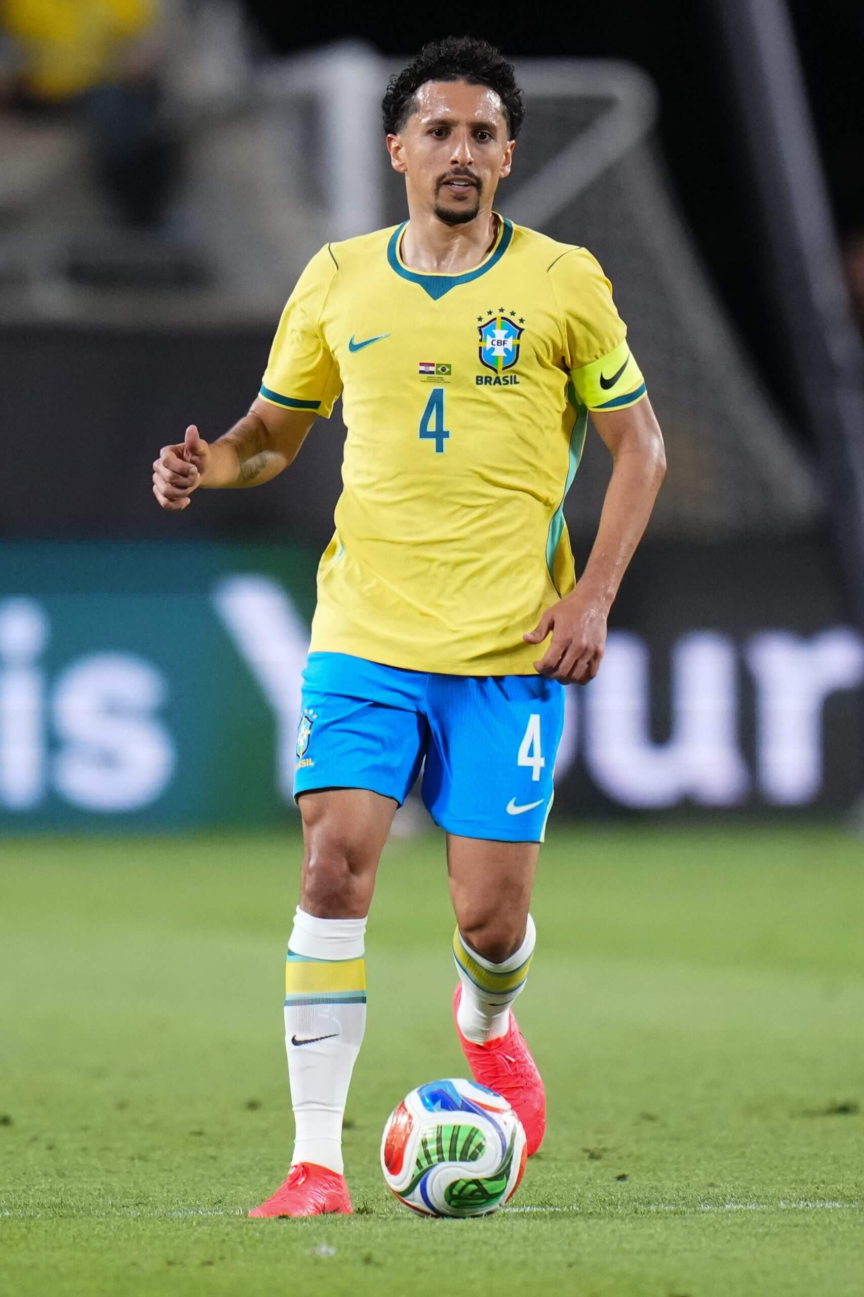
(Rich Storry/Getty Images)
So very, very good. It’s almost impossible to spoil the Brazil kit, although Nike did test that theory four years ago, but this is a tremendous return to form. It’s reminiscent of a couple of different Brazil designs from years past, most consciously their shirt for the 2004 Copa America with the collar and green trim under the arms but in terms of the cut, there are similarities with the wonderful 1986 version made by Topper too. There was talk a couple of years ago that Brazil might be shifting to Adidas, who have done their kits in the past, but some things must remain sacred: they’re Nike, and will hopefully stay that way for all time.
Photo:
(Rich Storry/Getty Images)
(Rich Storry/Getty Images)

(Puma)
Wow. In general, I’m not wild about Puma’s designs this year because they don’t seem massively interesting, but that’s absolutely not an accusation you can level against this one. It looks like a gigantic, multi-coloured spider’s web, because that’s exactly what it is. The design is inspired by kente, a traditional Ghanaian hand-woven textile, which apparently originated from weavers trying to replicate the patterns of a spider called Anansi from their ancient folklore. Even if you don’t buy any of that… well, just look at it.
(Puma)
The Style of Play series is sponsored by the Active Cash Visa® Credit Card from Wells Fargo.
The Athletic maintains full editorial independence. Partners have no control over or input into the reporting or editing process and do not review stories before publication.


Jun 8, 2026
Connections: Sports Edition
Spot the pattern. Connect the terms
Find the hidden link between sports terms
Play today’s puzzle